Categories
Uncategorized

The CROWN Act GIF

As a journalist, I aim to create and voice stories that matter and can inspire others. I decided that I would like to key in on The CROWN Act for my GIF project in Design in Journalism. The CROWN Act is a law that prohibits the discrimination of natural hair in places of learning and work. It has been passed in 4 states and is in the process of spreading it’s reach. I decided to take pictures of my friend and I, as it was a issue personal to us and it seemed only fitting that we bring it to life. It tells a story of a girl who is at first unsatisfied with her hair, yet after a little help she realizes just how beautiful it actually is. I wrote The CROWN Act on a bow that would be put into her natural hair along with the names of those affected by the injustices that The CROWN Act make sure to diminish. I also made sure to feature the name of the Oscar winning animated short, Hair Love as it protests for The CROWN Act as well. I made sure to get a multitude of angles in order for the bow to be seen on all sides. I could not be happier with how this GIF turned out and I hope it inspires other young African American girls like it inspired me.
Categories
Uncategorized

GIF Progress

I wanted to create a GIF that would show the perspective of a woman with natural hair. I had to rework my design and idea, as I misunderstood the assignment, however now I have a solid idea of what it should be. I will be getting help from my friend Wande, as I want the GIF to be composed of real pictures taken off our iPhone’s. I bought the supplies needed which are ribbons that I will be braiding into her hair and sharpies to write on the ribbons. We have decided that tonight we will go about braiding our hair and having the photoshoot. I am still deciding upon how many shots I want my GIF to be, however I feel like that will be dependent upon how many good and usable pictures we have to tell the story. I am excited to see how this will turn out and I hope that it inspires whomever watches it.

Categories
Uncategorized

GIF Plans

Photoshop, as I have learned, can be used for many designs and this time I am tackling the challenge of creating a GIF. I will be making this animation for Refinery29. The color pallete will feature bright colors to make the movement of the GIF pop more. It will feature the 29 changing to a symbol for woman in a back and forth manner. The font will be the same featured on their website, as I want to keep it consistent with their brand. I am excited to see how this creation will turn out

Categories
Uncategorized

Improving the Mood (Board)

Creating the Refinery29 mood board was a challenge, as I had never used photoshop beforehand and I set my expectations high. It turned out great and represents Refinery29 in a powerful way, yet there is always room for improvement. My peers, creatives themselves, are a great source of new ideas to take my mood board to new heights. A couple ideas were to make sure that my design didn’t get too messy. I had a lot of elements I wanted to play with, but sometime simplicity is key. Originally, my cork board was supposed to be in a circle, however a square was suggested as being a better idea because this way there would be more space to work with and the contrasting shapes, like stars and boxes would not conflict with each other. I was told that the stars could be a different color other than black which would allow them to pop and not blend in. Finally, the most valuable piece of advice I got was to relax. I was trying to be a photoshop pro off from the start. If a design doesn’t go the way you want it to go, rework to make it look just as good in a different way.

Categories
Uncategorized

That’s a Mood (Board)

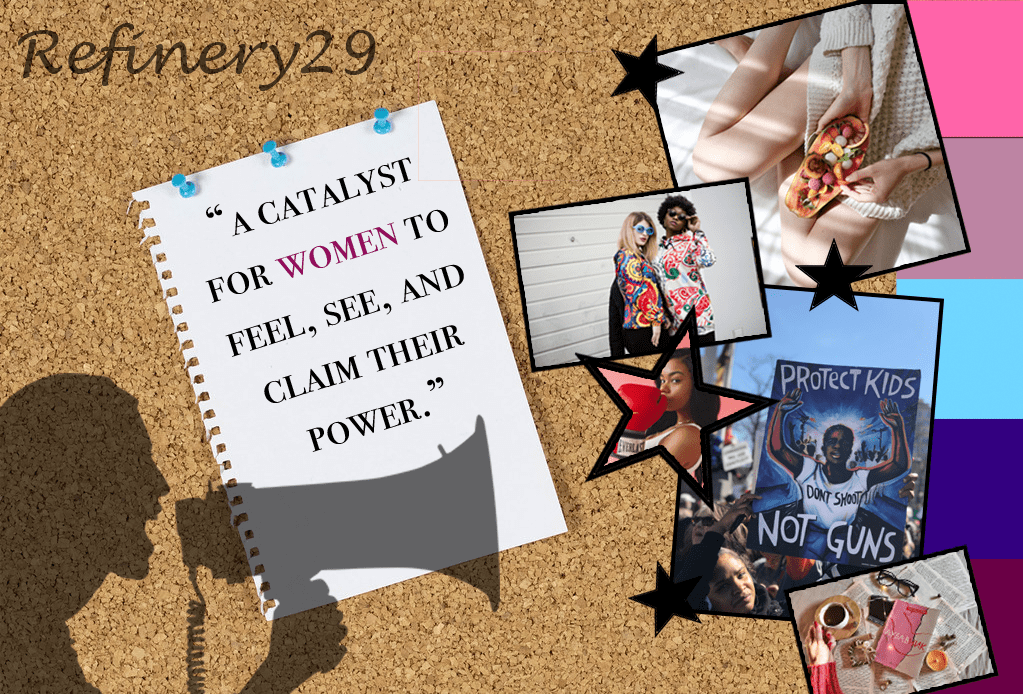
Refinery29 is an inspiring company that I strive to work for. A picture is worth 1,000 words, so it seemed only fitting to create a mood board that represents the reasons as to why I admire this powerful news organization.

Starting with the background of the piece, I decided to make it look like a cork board so that it could have a DIY, messy office kind of feeling. There is a piece of paper pinned to it featured with the words, “A catalyst for women to feel, see, and claim their power.” This is Refinery29’s motto and since their main goal is to inspire women I decided that I would highlight it in a different shading than the other words. I chose pink not because that is the traditional color used for women, yet because I wanted to take back the meaning. Pink is traditionally soft and delicate, which is depicted in this mood board alongside with power. The power of having a voice and letting it be heard. That is another reason why I have a shadowed feature of a woman speaking into a microphone. I have Refinery29 scripted in a cursive font to offset the sharp boxes of the pictures and give it more of a fun feeling. The pictures chosen represent the themes of the magazine, (going from top to bottom) self care, fashion, health, politics, and work life. I made the boxing picture a star because I thought it would be a nice deviation from boxes and therefore I added more plain black stars to make it fit in more. Finally, the color strip on the side is to pull in all the colors together to create a united piece.

Refinery29 Mood Board Assignment for Design for Journalists.
Categories
Uncategorized

Mood Board Progress

The Mood Board Assignment has been a little bit of a struggle. I am new to photoshop so I am learning as I am designing my board. I try to cut a cork board pattern into a circle, however I messed up the layering so I had to start over. I have the designs picked out that I would like to use, it is just a matter of applying them. I am working on the board in class and with the help of my friend. This will turn out exactly as I want it too.

Categories
Uncategorized

Main Points on Main Line Today

Main Line Today exhibits great design techniques that create an appealing front page to their viewers. My favorite element of their page is the contrast between fonts. The fonts fit well with the overall aesthetic of Main Line Today while nicely complementing each other. I especially love the contrast of the bold main title with the subtle subheadings. They do a great job with repetition as well, with all colors, fonts, and formats remaining within the same pattern to create a cohesive look of unity on the page. The biggest critique I have for this publication is their alignment. At times the page can look cluttered and overwhelming due to the non symmetrical columns featured. At first it starts out nicely, but as you scroll down the page the right side goes wild and is not aligned with anything and the sections are different sizes, making it overwhelming sight. If the website designers were to make it a little more organized, the sight would be even more visually appealing. As for proximity, the spacing of each section is distributed nice and evenly. The publishers are not afraid of white space and do not add unnecessary details. Overall, Main Line Today has a nice layout that is visually appealing to their viewers, yet there is always room for improvement, especially with the alignment. Main Line Today is definitely not crap, yet they do follow CRAP pretty nicely.

Categories
Uncategorized

Mood Board Inspo

Image result for refinery29
Refinery 29, a passionate lifestyle magazine, is the publication I dream of working at one day. The images below are the inspiration for my mood board centered around my dream job.
Image result for black girl magic
Representation of Social Justice Issues.


Image result for self careSelf Care.
Image result for fashion
Fashion.
Image result for travel
Travel.

Categories
Uncategorized

Redesigning the Regular

As a Temple Journalism major I aim to learn as much as I can about the field that I plan to share my voice with, from how words can affect people to how a design can affect people. The Philadelphia Tribune is a respected publication, having 625,000 weekly readers that crave to digest the latest content. Yet, there is ALWAYS room for improvement and a design aspect that I believe they could improve upon is their logo.

The Principles of Gestalt suggests an idea of closure in which the brain will take unrecognizable shapes that are in close proximity to each other and simplify them by creating an image. The Philadelphia Tribune’s logo has a sense of closure, however it still remains confusing. It would make the most sense that between the blue block and the red block the brain would form a cursive T for tribune, yet it can also be seen as a cursive F. Regardless, if the intent was a T for tribune I would consider a more impacting letter, as tribune is a common word for man news organizations. Another issue is that to complete the logo, there is a random piece taken out from the bottom that is unrecognizable by any means of closure. It leaves you wondering if that should be connected to the cursive T/F combination or if it is meant to stand alone. What is the significance behind this logo? The Philadelphia Tribune does an excellent job at communicating their message to the residence of Philadelphia through their journalism, and now all that is left is for their designs to do the same.

Categories
Uncategorized

Philadelphia Millennial Lifestyle Magazine

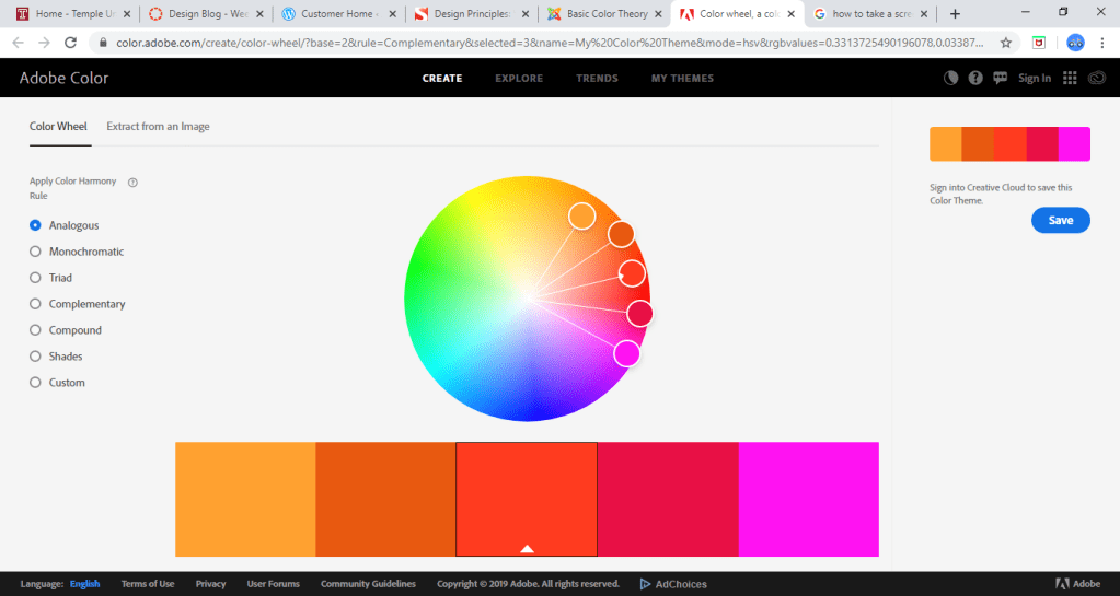
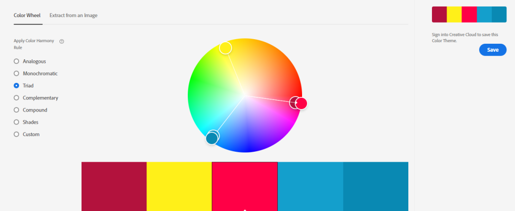
A Philadelphia Millennial Lifestyle Magazine. This has been a dream of mine since I picked up my first issue of Seventeen magazine. To be an editor for a magazine that inspires the youth, especially woman, would make success that much sweeter. I have everything planned out, down to the color scheme I created on Adobe Color. I chose warm and upbeat colors to match the vibe that I want to radiate from this publication.

Design a site like this with WordPress.com
Get started