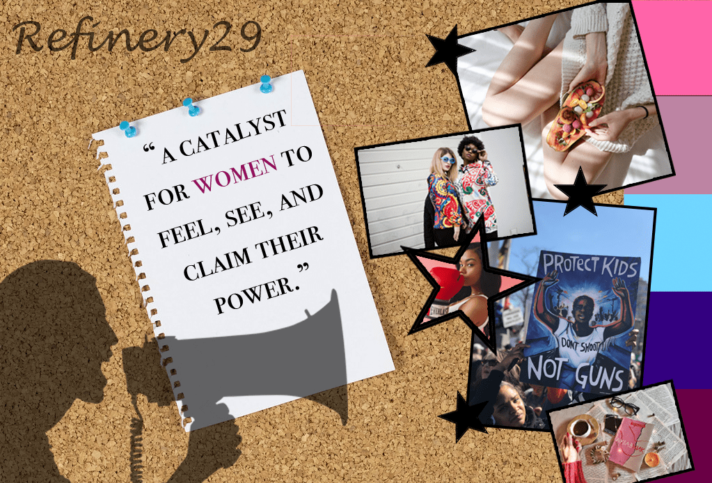
Refinery29 is an inspiring company that I strive to work for. A picture is worth 1,000 words, so it seemed only fitting to create a mood board that represents the reasons as to why I admire this powerful news organization.
Starting with the background of the piece, I decided to make it look like a cork board so that it could have a DIY, messy office kind of feeling. There is a piece of paper pinned to it featured with the words, “A catalyst for women to feel, see, and claim their power.” This is Refinery29’s motto and since their main goal is to inspire women I decided that I would highlight it in a different shading than the other words. I chose pink not because that is the traditional color used for women, yet because I wanted to take back the meaning. Pink is traditionally soft and delicate, which is depicted in this mood board alongside with power. The power of having a voice and letting it be heard. That is another reason why I have a shadowed feature of a woman speaking into a microphone. I have Refinery29 scripted in a cursive font to offset the sharp boxes of the pictures and give it more of a fun feeling. The pictures chosen represent the themes of the magazine, (going from top to bottom) self care, fashion, health, politics, and work life. I made the boxing picture a star because I thought it would be a nice deviation from boxes and therefore I added more plain black stars to make it fit in more. Finally, the color strip on the side is to pull in all the colors together to create a united piece.